
Here are the mobile app services of ISKAN, where you will have a seamless housing experience with more ease.
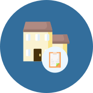
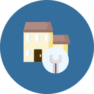
Avail numerous services MBRHE offers to a Customer

%20grant.png?version=1&modificationDate=1608711366141&cacheVersion=1&api=v2&width=90)


%20loan.png?version=1&modificationDate=1608711366984&cacheVersion=1&api=v2&width=90)


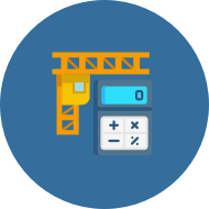
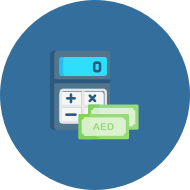
Avail the loans/ grants payments MBRHE offers to a Contractor


| Style |
|---|
body.page-gadget #main {
width: 100% !important;
}
#full-height-container{
background: #f9f9f9;
}
@font-face {
    font-family: 'Dubai-Regular';
    src: url('https://www.mbrhe.gov.ae/fonts/DubaiW23-Regular.eot');
    src: url('https://www.mbrhe.gov.ae/fonts/DubaiW23-Regular.eot?#iefix') format('embedded-opentype'),
         url('https://www.mbrhe.gov.ae/fonts/DubaiW23-Regular.woff') format('woff'),
url('https://www.mbrhe.gov.ae/fonts/DubaiW23-Regular.woff2') format('woff2'),
         url('https://www.mbrhe.gov.ae/fonts/DubaiW23-Regular.svg#DubaiW23-Regular') format('svg');
    font-weight: normal;
    font-style: normal;
}
#main{
	font-family: 'Dubai-Regular';
	background:#f9f9f9;
	margin-left: 0px !important;
	padding-left: 15px;
    padding-right: 0px;
    margin-right: -5px;
    font-size: 15px;
}

.columnLayout:nth-child(3) .cell.aside{
	vertical-align: bottom;
}
.columnLayout:nth-child(4){
	font-size:15px;
}
.wiki-content a,
.wiki-content a:link,
.wiki-content a:visited,
.wiki-content a:focus,
.wiki-content a:hover,
.wiki-content a:active{
	color:#015b98;
	font-size:15px;
}
#header .aui-header{
    background-color: #34709D;
}
.wiki-content img.confluence-embedded-image,
.wiki-content img.editor-inline-macro,
.wiki-content table.wysiwyg-macro {
    cursor: pointer !important;
}
.aui-header-inner{
	height: 41px;
}
#search-ui,
.aui-header-before,
.aui-header-primary,
#notifications-anchor,
.header-quicksearch,
#likes-section,
#labels-section,
#breadcrumb-section,
#page-metadata-banner,
.footer-body,
.ia-fixed-sidebar,
.space-tools-section,
.gtx-trans-icon,
.page-metadata-modification-info{
	display:none;
}
.wiki-content .contentLayout2 {
    margin: 0 !important;
}
.columnLayout:nth-child(1) .cell.sidebars:last-child h2{
    display:flex;
    flex-direction: row;
justify-content: flex-end;
}
.columnLayout:nth-child(1){
 background: #34709D;
    margin-bottom:10px;
display: flex;
    flex-direction: row;
    align-items: center;
    justify-content: space-between;
}

.columnLayout:nth-child(1) .cell.normal{
    vertical-align: middle;
}

.columnLayout.two-equal:nth-child(1) a{
	color:#fff;
}
.columnLayout{
	margin:0px
}

a#sv-scmtb-trsl-lang-picker {
    background: #35709d;
    color: #fff;
}
.wiki-content .confluenceTh,
.wiki-content .confluenceTd {
    border: none;
}
.columnLayout:nth-child(1) .confluenceTd{
	padding: 0px;
	padding-top: 6px;
    vertical-align: middle;
    margin: 0;
}

.columnLayout:nth-child(1) .confluenceTd h2{
margin: 0;
    line-height: 15px;
}

.columnLayout:nth-child(1) .confluenceTd span{
margin: 0px;
}

.table-wrap table.relative-table.confluenceTable td.confluenceTd{
text-align:center
}

.columnLayout:nth-child(3) .cell.aside {
vertical-align: top;
}


.columnLayout.three-with-sidebars .relative-table.wrapped.confluenceTable .confluenceTd{
text-align:start
}

.columnLayout.three-with-sidebars .relative-table.confluenceTable .confluenceTd {
    text-align: start;
}
.columnLayout.three-with-sidebars .relative-table.confluenceTable .confluenceTd a{
    color:#fff;
}

.columnLayout.three-with-sidebars .relative-table.confluenceTable .confluenceTd a {
 color: #fff;
vertical-align: top;
text-decoration: none;
}

img,a{
  -webkit-user-drag: none;
  -webkit-user-select: none;
    -moz-user-select: none;
    user-select: none;
}
#header .aui-nav #login-link{
  display:none
}
.wiki-content .contentLayout2 {
    margin: 0 !important;
}
colgroup{
    display:none;
}
td:empty,
p:empty{
    display:none !important;
}
@media screen and (max-width: 768px) {
.columnLayout:nth-child(3) .cell table td img{
    width:70px !important;
    height:auto;
}
.columnLayout:nth-child(3) .cell{
    display: block;
    width:100% !important;
}
.columnLayout:nth-child(1) {
    flex-direction: column;
}
.wiki-content .columnLayout .cell.sidebars {
    width: 100% !important;
}
.columnLayout:nth-child(3) .cell table{
width: 100% !important;
}
.columnLayout:nth-child(3) .cell table td {
    width: 43% !important;
    display: inline-block;
}
}


body.page-gadget {
    padding-top: 10px !important;
} |